
| User Roles |  Admin Admin |  Staff contributor Staff contributor | External contributor | Pulse user |
Silverfin has a redesigned navigation: the top navigation has moved into a collapsible left-side panel, and a number of everyday tasks now take fewer clicks. This article explains what has changed, where to find things, and how to switch between the two versions.
Table of contents
- What's happening
- You're still in control
- Do more from wherever you are
- Move through your work in fewer clicks
- A cleaner, calmer layout
- Tell us what you think
What's happening
The redesigned navigation replaces the old top navigation with a collapsible left-side panel. It gives you quick access to the most important places in Silverfin, so there is less digging around pages, and it reduces the number of clicks needed to jump between workflows and core pages such as adjustments or exports.
Nothing about your work changes. It is the same Silverfin, with a cleaner and faster layout around it. The redesign is built around three things:
- Saving you time: fewer clicks to reach the things you use most.
- A more modern interface: a cleaner, up-to-date layout that keeps pace with the platform.
- A focused work space: more control over your screen layout, so you can keep context visible or focus on a working paper. On larger monitors you can now have the communications panel and the workflow navigation open at the same time.
The new interface started as an open beta in July, available to every user at every firm. It is now switched on by default, so you log in to the new look rather than having to turn it on yourself.
You're still in control
The old version is still available. To go back to it, use the option at the top of your screen. You can switch between the two versions as often as you need to.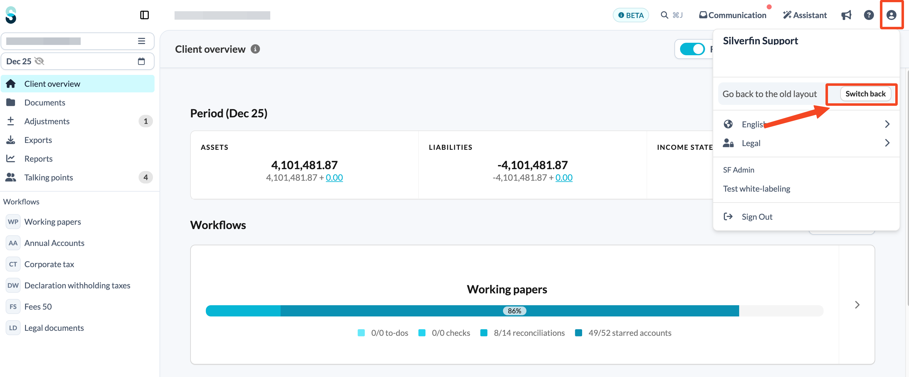
We are phasing the change in gradually so that everyone has time to get comfortable before the old interface is eventually retired. We are currently targeting mid October to mid November for a phased switch off of the old navigation.
Do more from wherever you are
A few common jobs used to mean navigating to a specific screen first. You can now do them from anywhere in a client file.
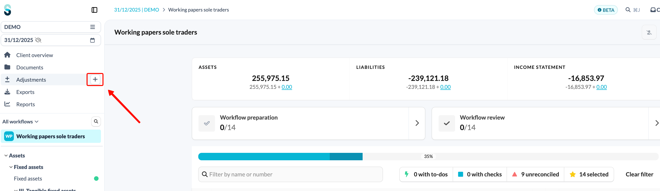
Add an adjustment from any page
The Adjustments item in the menu now has a quick-add button, which appears when you hover over the item. You can raise a new adjustment from anywhere within a client file, rather than only from inside an account template. For the adjustment itself, see How to create and post adjustments?
Jump straight to mapping
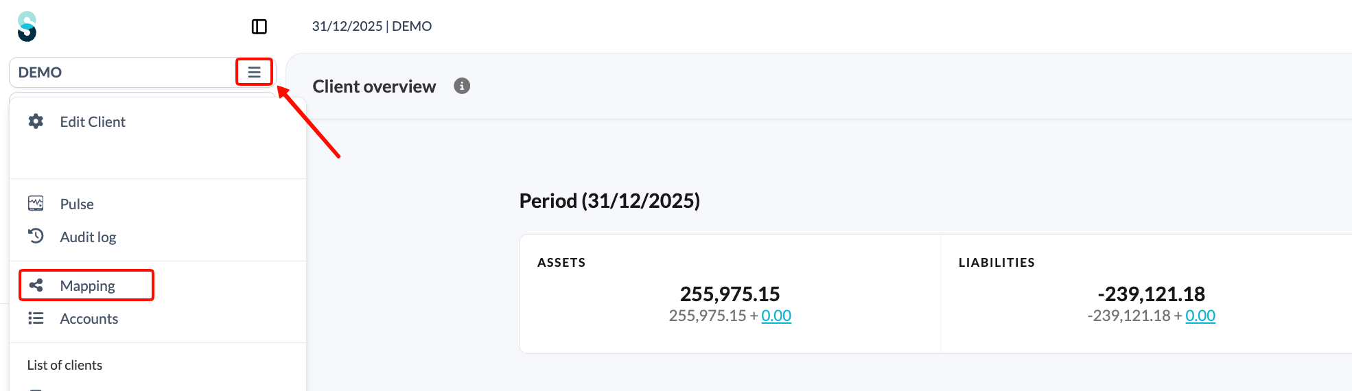
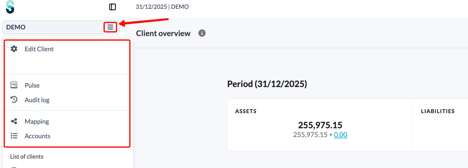
Mapping now has its own link in the client file dropdown menu, so you no longer need to open Accounts first to get there.
Move through your work in fewer clicks
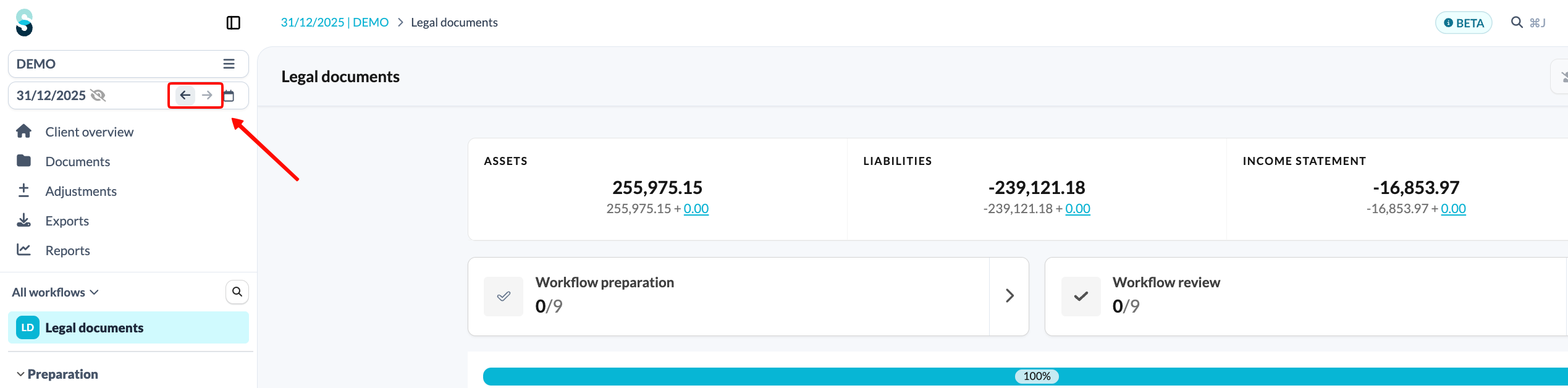
Step back and forward through periods
Hover over the period selector and you will see back and forward buttons. Moving between the prior year and the current year takes a single click, rather than opening the full picker.
Your recent templates, close at hand
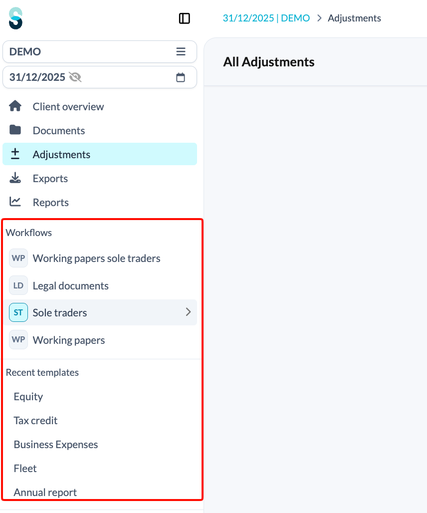
On core pages such as Adjustments and Client overview , the menu shows your workflows alongside your five most recently used templates, so you can pick up straight where you left off. Silverfin also remembers how you left your workflow, as explained in How does Silverfin save your workflow view?
A cleaner, calmer layout
Less clutter
Thanks to the new client file dropdown menu, less frequently used pages stay available without taking up screen space during your day-to-day work.
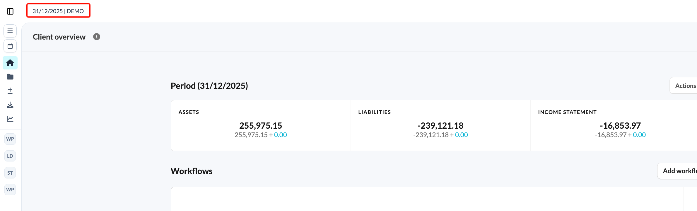
Key details remain visible when the menu is collapsed
When you collapse the sidebar, the period and the client file name stay visible as a breadcrumb, and the sync button moves to the top right of the screen. You never lose sight of crucial client and period information.
You can also open and close the left and right side panels with a keyboard shortcut. On a QWERTY keyboard, use the [ and ] keys. On an AZERTY keyboard, use the , and ; keys.
A tidier top bar
The top-right buttons have clearer icons and more even spacing, and the unread notification indicator now grows into a badge, which makes it easier to spot.

A scroll bar you can always reach
On wider templates, the horizontal scroll bar is pinned to the bottom of the screen, so it is always where you expect it. This makes navigation on complex pages easier.
Tell us what you think
Several of these improvements came directly from user feedback during the beta phase, so please keep it coming. We are still gathering feedback on what we can improve, both now and in the longer term. To follow what else is changing in the platform, see Where can I find the latest Silverfin updates?
Once you are in the new navigation, click the Beta tag at the top of the screen to open a short feedback form. Every comment helps us decide what to improve next.